Chronic illness can feel overwhelming, impacting both physical and mental well-being. But what if there was a simple, visually-driven way to find comfort? Research suggests that color patterns, carefully chosen and strategically arranged, can have a profound soothing effect on individuals living with chronic conditions. This article explores the science behind this phenomenon, offering practical tips for incorporating color patterns into your environment to promote relaxation and well-being.
The Science of Color and Its Impact on Mood
Our brains are wired to respond to color. Different hues trigger specific physiological and emotional responses, influencing our mood, energy levels, and even our pain perception.
Blue: Often associated with calmness and tranquility, blue can lower blood pressure, heart rate, and even reduce anxiety.
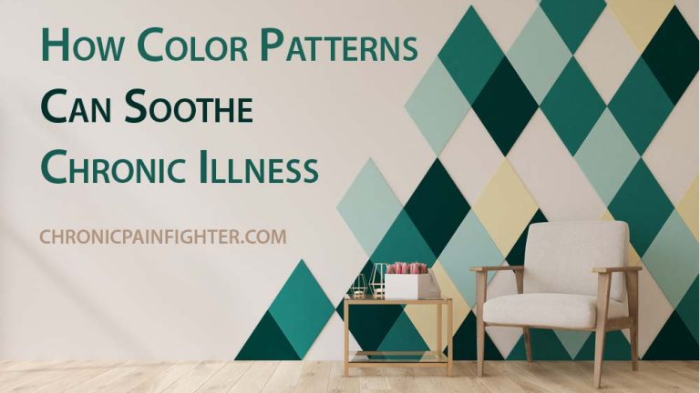
Green: A natural color that evokes feelings of peace and renewal, green can promote relaxation and ease tension.
Purple: Evokes feelings of royalty and spirituality, purple is often used to promote serenity and calm the mind.

Warm Hues: Yellow, orange, and red can be energizing and stimulating, but they can also be overwhelming for individuals already experiencing discomfort.
Neutral Hues: White, gray, and beige offer a sense of neutrality and can help create a calming atmosphere, especially when paired with softer tones of blue, green, or purple.
How Color Patterns Can Aid in Chronic Illness Management
Reducing Stress and Anxiety: Studies show that exposure to calming colors can help reduce stress and anxiety. A bedroom painted in soft blue or a living room featuring calming green tones can create a more peaceful atmosphere, allowing for better rest and reduced feelings of overwhelm.
Improving Sleep Quality: The link between color and sleep is undeniable. Blue hues, particularly cooler shades like aqua and teal, can promote relaxation and prepare the body for sleep.
Managing Pain Perception: Color can even influence how we perceive pain. For example, a study by the University of Texas at Austin found that patients in a blue-painted room reported less pain than those in a yellow room. This suggests that incorporating calming blues and greens into a pain management strategy could be beneficial.
Boosting Mood and Optimism: While warm hues can be overwhelming for some, strategically used pops of yellow or orange can provide a boost of energy and optimism, especially during periods of low mood. These colors can be incorporated through artwork, throw pillows, or decorative accents.
Practical Tips for Creating Soothing Color Patterns
1. Identify Your Personal Preferences: What colors do you naturally gravitate towards? Experiment with different hues and tones to find what brings you comfort and tranquility.
2. Consider the Room’s Purpose: The color scheme for a bedroom should be different from the color scheme for a home office. Choose colors that promote the desired feeling for each space.
3. Experiment with Color Combinations: Don’t be afraid to try different color combinations. You can start with a base color and then add accents in other hues.
4. Incorporate Natural Elements: Bringing elements of nature indoors can further enhance the calming effects of color. Use plants, flowers, and natural materials like wood or stone.
5. Avoid Over-stimulation: Avoid overly bright or jarring colors that might feel overwhelming. Stick to muted tones and softer shades for a more peaceful atmosphere.
Beyond Color: Additional Considerations for Creating a Soothing Environment
1. Lighting: Soft, natural lighting is preferable to harsh fluorescent lights. Consider using dimmers, lamps, and natural light sources to create a more relaxed ambiance.
2. Sound: Reduce noise pollution by using white noise machines, soothing music, or nature sounds.
3. Scent: Essential oils like lavender, chamomile, or eucalyptus can promote relaxation and reduce stress.
4. Texture: Soft, comfortable textures like plush fabrics or natural materials like wood can create a sense of warmth and security.
5. Simplicity: Avoid clutter and create a feeling of spaciousness by organizing your belongings and minimizing distractions.
Conclusion:
Color is a powerful tool that can be used to enhance well-being, especially for individuals managing chronic illnesses. By carefully choosing calming color patterns and incorporating additional elements of comfort, you can create a soothing environment that promotes relaxation, reduces stress, and helps you navigate the challenges of chronic illness with greater ease. Remember, your surroundings can have a profound impact on your mental and emotional state. Embrace the power of color to create a space that fosters peace, tranquility, and a sense of well-being.